QUESTION 2: HOW EFFECTIVE IS THE COMBINATION OF YOUR MAIN PRODUCT AND ANCILLARY TEXTS?
HOW EFFECTIVE IS THE COMBINATION OF YOUR MAIN PRODUCT AND ANCILLARY TEXTS?
When discussing Branding, it is very sufficient that certain images can be easily recognised with your own trailer and movie. Branding can help you stand out from your competitors, add value to your identity and engage your spectators. The stronger the brand, the more effective or well known the iconic image will be the higher the popularity and the more viewers your movie will achieve. When relating to the Horror genre the brand identity can consist of different varieties of brands which can conclude, props, persona, setting, logo and even the font can be a significant part of your icon.
When discussing Branding, it is very sufficient that certain images can be easily recognised with your own trailer and movie. Branding can help you stand out from your competitors, add value to your identity and engage your spectators. The stronger the brand, the more effective or well known the iconic image will be the higher the popularity and the more viewers your movie will achieve. When relating to the Horror genre the brand identity can consist of different varieties of brands which can conclude, props, persona, setting, logo and even the font can be a significant part of your icon.
|
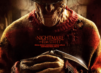
'Nightmare on Elm Street' features infamous villain Freddie Krueger. Freddie Krueger is iconic due to his weapon of choice, his knives that are attached to his fingers like claws. The shape and outline of the claws are recognisable and synonymous with the film.
|
|
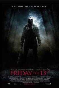
This is the iconic mask from the film 'Friday the 13th' (2009) where Jason, the villain, uses this mask as a defence mechanism as well as a sinister way to protect his hideous distorted identity. The way the light beautifully shines on the mask reflects a silhouette of a 'figure' behind the mask, it creates a question of who is behind the mask and whether they are a 'man' or a 'monster'. Which follows the narrative of the story where we find out that Jason is actually deceased and basically 'came back from the dead'. It seems to be as followed that the effective branding is most commonly the thing that scares us the most when dealing with the genre of horror. It leads us to the conclusion that the idea of the brand is to have the most iconic image from that film.
|
|
|
Font can be used to enhance the films brand. However, we want to avoid this as we want to keep it as minimalistic and simplistic as possible. For example;
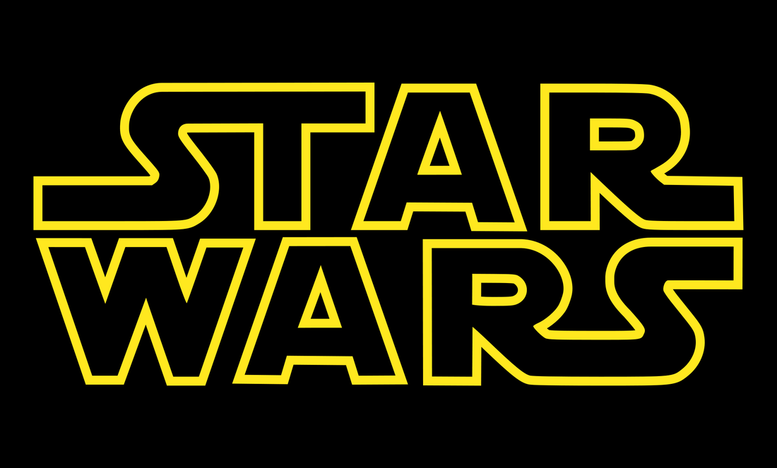
'Star Wars' was a massive cinematic film in the 70's and onwards where the same font has been used through out each and evert film ever made by George Lucas. Due to this, the audience has overseen the villain Darth Vadar or the protagonist Luke Skywalker and has payed more attention to the type of font rather than any of the main persona or props. Star Wars has adapted that style of font and made it their own by using it in every motion picture. When you see this font, even though it's stating it's title, you already realise which film is it without even really seeing any of the main characters. |
|
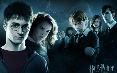
'Harry Potter' is a massive phenomenon which is ironically made in Britain. It is ultimately another example of where the font is the main brand of the film. This gives an unusual feel to brand identity and seems to be quite unrealistic as you'd normally associate 'Harry Potter' with the main three protagonist and the villain
|
|
BRANDING OUR MAGAZINE COVER AND POSTER
OTHER COURSEWORK POSTERS AND MAGAZINES
Being about a drug that turns friends into killer the group who named their teaser trailer guilt trip decided to use a knife as their iconic image. The knife follows the connotations of death by having a blood splat at the bottom of the blade suggesting it has been used as a weapon. We are using the idea of having an icon from our trailer on the poster, however in our case the icon is a zombie as it conveys our genre and focus. We took inspiration from looking at previous coursework's especially through looking at posters. From viewing previous coursework's it allowed us to see that the most effective poster conveyed an iconic image that related to the trailer, this lead us to choose our iconic image for our branding.
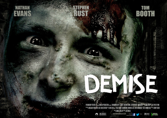
ORIGINAL IMAGEThis is our original image that we used for our poster. We used high amounts of makeup on the actors face to make him look bruised and battered, we also used fake blood to make the zombie look injured and damaged. We took the picture of our zombie in front of a green screen and plan to zoom in on the face, and make that the main image on our poster.
|
FINAL POSTERThis is our final draft of our poster, We have used a white title to allow it to stand out against the cold grey background and be easily visible. Using the software photo shop we able to expand on our original zombie image and make it look as realistic as possible. We then finished it of by adding a destroyed looking background which came from a picture of abandoned buildings we used whilst filming.
|
INITIAL POSTER DESIGN
Our initial poster design was very similar to our final poster as we used the same image of our zombie taken with a very high resolution camera. However our original poster design was to use the image of the zombie without any editing to create the half human half zombie look. This was possible through using the original image as the zombies pale skin was still visible making it look human like.
