Distribution Company
|
|
For our distribution company we were able to use an already existing company logo. Therefore we chose "Paramount pictures" because of its notoriety and success in film distribution. The distribution moving picture is of a night sky with the title of the company flying into the centre of the picture. We thought this distribution company out of all of them was the most successful as they have recently distributed new hit films such as Transformers age of extinction, and Teenage Mutant Ninja Turtles. This therefore influenced us to choose this company as it has been evidently successful within distributing new movies and also within the horror genre as well.
|
|
Another distribution company we looked at is Warner Bros. Television. The moving image has a lot of different templates as it features an image of the studios then drifting into the logo of Warner Bros. This is what we found particularly effective and it looked very professional. The distribution company have helped distribute films such as Harry Potter which has then gone on to been very successful in the film franchise, they have also distributed the horror films Annabelle and Oculus.
|
|
|
|
The last distribution company we viewed was 20th century fox. The simple short image of the large podium symbolises the title up in lights which makes it look ironically successful as the stage lights are making it centre of attention. 20th century fox have distributed world famous films such as Star Wars and planet of the apes in which all have been very successful . This therefore makes the distribution company look even more appealing from its previous success and we considered using it over paramount pictures.
|
PARAMOUNT PICTURES
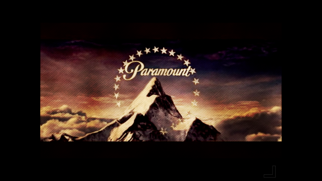
We chose to use the already existing distribution company logo paramount pictures. The moving image itself was plain and simple following the usual colours of the sky, baby blue and stone white clouds. However to convey the zombie genre even through our distribution company we transformed the colours into an almost dusk look to the sky, the colours link in with the rich red and orange tinge the sky takes when night is falling. The also grainy and dark background again links in to the grim appeal within a zombie apocalypse, the colours we used also convey the zombie genre as colours such as red,blue and purple are all considered as negative or dangerous. (TB)
