Poster Research
When looking at horror there are always many different key icons from characters to weapons there is always one that sticks out the most. When researching different Horror posters the most of them were different in certain ways. The most effective looking posters were the posters that were character based as they made key members of the film the film the centre of attention on the poster. Aswell as the image a movie poster also has to include the actors names, ways to access or follow the film online and the mention of the production and distribution companies. Some of our favourite posters from our research were the horror/comedy film 'Zombieland'
|
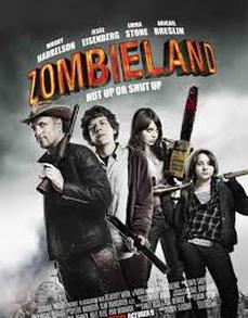
The poster of the film 'Zombieland' features the four main characters of the movie as the centre of attention. The four characters are also in a formation or line up of some sorts which suggests them as the main theme of the film. We found this very effective as our created horror trailer 'Demise' used three main characters meaning they could be featured on our poster. This gave us our first idea to use for a Zombie themes poster as the four characters become a key icon on the poster and represent the film in an appealing way. The second feature we liked about this poster was the props. The props being the weapons are also iconic icons within the film and are shown to look powerful and meaningful through the characters positions/stances. The weapons such as guns and chainsaws are also iconic weapons to the zombie genre making it more relevant to our chosen theme and keeping the idea of Horror. This again can be interpreted through our poster as we use iconic weapons like a baseball bat which can be highlighted by one of the characters in the poster.
|
|
|
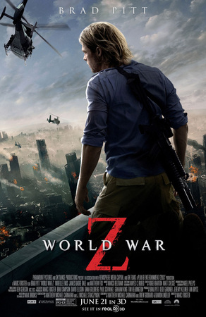
The next movie poster we looked at was the recently released film 'World War Z'. The trailer appealed to us in particular as it conveys the idea of the zombie genre by showing destruction and demolition throughout the city. The key icon of the poster being the main actor Brad Pitt makes him the centre of attention and main theme of the poster. This is something we found interesting as instead of adding a few of the main characters they have stuck with the one making him the key icon and logo of the film. The title is also important within this poster as they have used red colouring for the letter 'Z' conveying blood and gore within the zombie genre. This is something we want to use in our title as it makes it stand out and look effective in front of the background. We are also going to look at maybe using just one character as the icon and place them in the centre of the poster so there can be more attention on a single character rather than three.
|
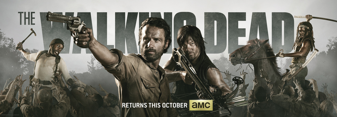
The walking dead poster particularly appealed to us as the shows genre suited ours so well. The poster consists of different layers including the main 4 characters in different action shots with a series of events going on around them. As the walking dead is a very successful show we decided that we would mould ours around this as best as we could without copying it. After looking at many different posters that were successful our main idea still remains to keep all three characters centre of attention, behind the characters will be a grimy and destroyed backset which will convey the zombie apocalypse. The characters will each have some kind of apocalypse icon such as a baseball bat, rucksack and other various weapons. TB
