1. In what ways does your media product use, develop or challenge forms and conventions of real media products?
Conventions within our costume, props and makeup
|
Blood and Gore:
Blood is always a necessity in a zombie film as the view of a zombie must be deranged and decayed therefor making the zombies look rough and destroyed. Most zombie films such as 'World War Z' and '28 days later' convey their blood through the death of the zombies, even though there is a focus of the blood round the zombies mouth and body there is still a large emphasis of the blood poring out of the zombies when there taken down. There is also an emphasis on the blood on the floor representing the theme of death, the usual age convention of a movie with blood and gore can be anything from 15-18 which is why we decided to make ours a 15 meaning we can show all the necessary conventions of blood |
|
The blood and gore in our trailer was shown through the zombies presentation. We used the look of deranged zombies with blood all over their faces making them look more crazy than usual. This adds a fearsome vision to the zombies and follows the usual conventions of a zombie genre. We also tried to show blood on the floor to convey events with the un dead that had previously happened.
|
|
Costumes:
The costumes within a horror are always important as it determines what kind of characteristics the character will have. For example if the character is wearing well put together clothing it shows they are usually a very proud and stern character often trying to show their authority. Another example is characters wearing uniform, particularly in the zombie genre the remaining army or police are normally still wearing some kind of uniform to show the position and to attempt to keep their authority. As well as the characters costumes the zombies must have a well designed costume aswell, it is vital to make them look as ruined and rough as possible to give a real scare factor and make the audience feel eerie when watching them. The usual conventions for a zombie within the genre is to have ripped clothes with often blood poored down them or marks |
|
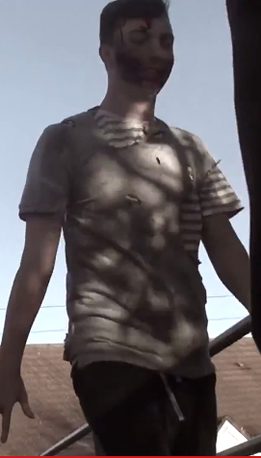
The costumes we used were hand made and tailored to our specification. We wanted the zombies to look rough and taty to show what they had been through in the apocalypse. To do so we took some unused and old t shirt and burned certain areas of the chest and sides we also made sure they were dirty by leaving them in mud and applying fake blood to the necessary areas, we also included some large rips where wounds and injuries would be able to be visible on the zombies skin. This helped us keep the correct conventions of how a zombie is dressed. For the characters we tried to use old looking clothes to convey that the characters had found them whilst scavenging. All the characters had either a jacket or hoodie which was there only warmth when travelling, they all also had mud splatted up their trousers and dirty shoes to portray the long journey they had been on.
|
|
Props:
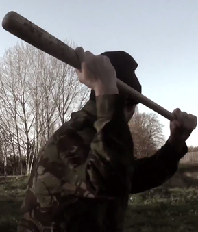
Within any film the props are always a key element in making it look realistic. often props such as firing guns or arrows are edited onto the clips by using top of the range software. However we do not have that software and because we were filming a zombie horror we decided to use older fashioned and improvised weapons such as cricket bats and baseball bats. This again shows the characters had no preparation and that the zombie apocalypse got out of hand fast, this not only adds more of an insight to the story but it also shows the weapons that are usually associated with zombie horror. in particular the baseball bat, like shown in he hit series 'The Walking Dead' the bat is seen as a quick way to take down a zombie and keep moving which is what happens within our trailer. aswell as weapons we also used props such as back packs to show that the characters have been travelling, backpacks within the zombie genre are also usually shown to have vital supplies in such as food water and equipment to show how little the characters have left. |
|
The props in our trailer such as the baseball bats and rucksacks were all carried by the main characters. Through our three characters we managed to include the vital props that are conventional to the zombie genre. The bat was seen in action by the character played by Stephen Rust where a zombie was taken down by a large swing and a groan from the zombie. The weapon allowed us to convey a conventional killing of a zombie. The back pack carried by the character played by Tom Booth was shown throughout the whole and was scene as a vital possession to get back when they were caught by the cannibals. This again shows a prop that is conventional to the horror genre and is necessary that at least one character is carrying one. In ways we did challenge conventions by not showing exactly what was in the rucksack suggesting their could be something either private or suspicious that the character doesn't want to be seen or found.
|
|
Makeup:
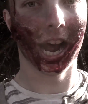
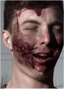
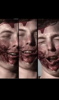
Last of all is the makeup, makeup is the most important part when making an effective zombie as without it its just a standard person in dirty clothes. Shows like the walking dead have all kinds of make up specialists to make the zombies look scar'd and bruised, their is often a paleness to the face to symbolise death and dark marks around the eyes. On top of all of that is usually a lot of blood and sometimes even missing facial features such as a missing jaw or teeth. The conventional zombie usually has a visible bloody mouth which is often shown snarling and growling in attempts to bite survivors. They also have skinny looking faces to again show the effects of death, in general the easiest way to make a zombie look effective is to make them look as dead as possible. |
|
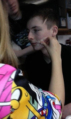
The make up on our two zombies took a lot of time and effort but turned out to be worth it. We used a friend who had always been into makeup to help build a conventional zombie face. We used things such as blusher, powder and black face paint to make the initial dark eyes and skin colour. To make the cuts we used glue and liquid latex with a helping of fake blood and red paint, this helped the cuts to look deep and serious adding more effect to the zombie face. To also keep to conventions we used a lot of fake blood around the zombies mouth and chin, this made it run down his body and make it look as if the blood was dripping from his mouth.
|
Using convention
|
Typical Zombies:
Our aim was to show zombies that you would typically find in a post-modernist zombie film. This is because generally zombies are used more popular today, to portray the idea of a world in a state of devastion such as one that is post-apocolyptic. This is the idea that we wanted to emulate in our trailer. Modern Zombies are also typically portrayed with an image consisant of blood, ripped clothes and in rotting or decaying flesh. |
|
The zombies we created in our trialer all pocess these typical qualities. We portrayed are zombies like this so the audience would easily recognise and associate the zombie theme, and identify our trailer as a zombie genre. Zombies have been popularised in modern horror culture through use of these conventions.
|
|
Fast Pace Shots
Fast paced shots are a popular technique that we have incorporated throughout our trialer. We did this to create tension within the trailer, as well as a sense of action. Tension is an important feature in modern horror trailers as todays masochistic audiences enjoy the sense of fear; a theory presented by Colin Klein. |
|
This engages the audience as they enjoy the fear and want to be scared more. Fast pace shots also allow us to put a large verity of short shots in our trailer that cover multiple elements number of different methods of horror from our trailer
|
Challenging conventions
it is often too easy to try and replicate or copy horror conventions and few films challenge them, however we wanted to add a twist on our horror and challenge certain conventions in an attempt to make our horror unique. The first convention we drifted away from was having one set genre, many horror films have just one genre of focus for example, Scream (1996) is a slasher and keeps this one genre throughout. However to change conventions and make our trailer unique we added two genres in one film, we used the genre of zombie and added a cannibalistic twist giving it an unusual double genre. This allows us to create two completely different character bases, the cannibals and the survivors this then allowed us to add more action and thrill making the trailer as different and unique as it can be
Another convention we drifted away from was the usual zombie setting. Often zombie films are set in big cities portraying how the city falls under the great pressure of a zombie apocalypse, they also show how too many people in one place can cause riot and destruction. Although we live near a fairly large town where a good location could be set we decided to film in more urban areas to show how different civilisations of people deal with the zombie apocalypse. Because we filmed in the typical urban area which included parks, estates and fields we were able to use this to our advantage. We also had the advantage of using large open fields ,quirky street corners and gloomy bridges to give the zombies the best fear factor we could and locate them in an even scarier looking set.
Another convention we drifted away from was the usual zombie setting. Often zombie films are set in big cities portraying how the city falls under the great pressure of a zombie apocalypse, they also show how too many people in one place can cause riot and destruction. Although we live near a fairly large town where a good location could be set we decided to film in more urban areas to show how different civilisations of people deal with the zombie apocalypse. Because we filmed in the typical urban area which included parks, estates and fields we were able to use this to our advantage. We also had the advantage of using large open fields ,quirky street corners and gloomy bridges to give the zombies the best fear factor we could and locate them in an even scarier looking set.
Developing conventions
Using slightly deranged zombies instead of fully decayed ones was the first convention we developed on. Usually within zombie films the un dead are seen to have jaws falling off, limbs missing and giant bullet wounds to their bodies. We developed this by having slightly less ruined zombies,as our zombies only had blood wounds and scratches upon them showing that the infection was only just taking effect.
Similar to the above the next convention we developed was setting the apocalypse early on instead of starting it where most of the world has already perished. in many zombie horrors such as 'The Walking Dead' the apocalypse is already in full flow meaning there are a lack of survivors, however ours is set at the very start of the apocalypse which is why the zombies are not as decayed and deranged as usual. It also creates more of a realism when meeting fellow survivors as the world has not yet fallen.
Similar to the above the next convention we developed was setting the apocalypse early on instead of starting it where most of the world has already perished. in many zombie horrors such as 'The Walking Dead' the apocalypse is already in full flow meaning there are a lack of survivors, however ours is set at the very start of the apocalypse which is why the zombies are not as decayed and deranged as usual. It also creates more of a realism when meeting fellow survivors as the world has not yet fallen.
Magazine conventions
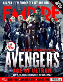
Magazines have many conventions from the image on the cover to the text around the image, all are important to take note of when making a realistic magazine cover. The first convention we followed was to have an image of the characters as the centre of attention. Many magazine covers have either a character or prop as the main convention, with this in mind we went for the three main characters of our trailer in hope they can represent the film. We took inspiration by the recent 'Avengers age of Ultron (2015) magazine cover in which features the main characters in the centre of the page.
|
We particularly liked the way the title of 'EMPIRE' was behind the characters head making the characters look powerful and important in front of the background. This was particularly effective as it made the characters centre of attention which was something we wanted to achieve. As such we decided to structure our magazine cover on the Avengers cover as it fitted perfectly with the specifications we wanted for our poster. We also liked how the title of the film was in the colour white and made to look bold underneath the characters again making it look very effective in front of everything else. The colour white also adds a brightness to the title making it the first thing you see when looking at the magazine cover.
|
Poster conventions
As well as the magazine, the poster also needs to be taken into consideration of what conventions and themes should be used. The movie posters usual connotations is to have the title at the bottom of the poster with the credits underneath. This is something we wanted to take on board as it not only suits our style of poster but also is a very popular lay out amongst other zombie posters. The title also needs to be bold with appropriate colours to the style or genre of the movie, for example slasher posters are usually coloured in the iconic red, representing blood, death and danger. A zombie title is often white and either slightly faded or cracked to symbolise decay and destruction. As such we decided to take the convention and use it within our own therefore making our title look cracked and dirty which are all connotations of a zombie apocalypse.
|
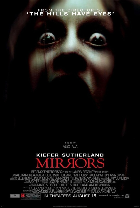
The poster from the film 'Mirrors' met what we thought to be all of the usual conventions of a poster. It contained a title at the top of the poster which is usually a catch line or information about previous films. In this case the title was about a previous film which advertises the creators and suggests that the new movie will be something better. We liked the usual convention of a title at the top of the poster however we decided to go against the conventions of the 'Mirrors' 'poster and include our catchline as opposed to previous movies. The poster also has the main title at the bottom with the solo image in the middle. We like the connotations of that within a horror poster which is why we decided to use the idea within our own poster where we have used a solo zombie and placed the title at the bottom. With titles at the top and bottom of the page that leaves the main focus on the image in the middle which in our case is the icon of our horror.
|
