Magazine font
Choosing the appropriate style of font is very important when creating a magazing cover. There are a number of elements to consider such as; how easily the reader can understand the text, and how the style of the font fits with the genre of the project. The choice of font needs to be clear and easy to understand so the title is easily recognisable. If a title becomes recognisable then the title will easier gain attenton. In terms of the font suiting the genre of the trailer, it needs to be easily distinguished as a horror so the audience knows immediately what type of trailer it is.
|
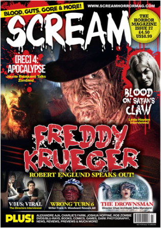
This magazine cover promotes the 'Nightmare on Elm Street' film, depicting its infamous villain 'Freddie Krueger'. The font choice for this magazine cover in particular uses a deep red text. This colour of font is strongly assosiated with blood and gore, and is commonly used in the film industry to represent the genre of horror. The style of the font is given the apperance to seem as if it has been ripped and tared which is stronly related to the character of 'Freddie Krueger', as the character rips and tears the flesh of his victims in the 'Nightmare on Elm Street' films, using his metal claw-like blades attached to his fingers. Using a style of font that has a strong links to the film or its style and genre is very powerful in terms of audience recognition and association. Even if the audience is not familiar with the film that a certain magazine cover is promoting, the style of the font (including the choice of colour), plays a big role in giving the audience an idea of what kind of what kind film the magazine is promoting. The text on the poster works together with the pictures and images on the poster to give the audience a brief idea and clue of what the magazine is trying to promote. (SR)
|
