Production Company
|
|
INTREPID PICTURES
This is the animated logo for Intrepid Pictures. The reason why we have chosen this one is because it was very professional and nicely done it also entertained for the fourteen seconds it is displayed for. Although it is a lot longer than what we need it could still be shortened down and used. It is effective as the use of lightning makes the production company appear very professional. The colours and other visual effects captivates the viewer as it is a joy to watch. The zoom out from the original video to the logo using lightning is effective as it makes the animated logo more memorable and allows the logo to be recognized in the future.
|
|
BLUMHOUSE PRODUCTION
This the animated logo for Blumhouse Productions. This is an effective as it is memorable through the displaying of several iconic horror themes such as haunted 'ghost girls and flickering lights followed by the logo itself. This is effective as it impresses its viewer and so makes it an effective animated logo. We incorporated this idea into our production company through using the colour scheme. We particularly liked the dark use of colours as it really captures the horror effect and adds to the fear of the film to come.
|
|
|
|
DARK CASTLE ENTERTAINMENT
This is the animated logo for Dark Castle Entertainment. This was effective due to the progression from the horror icon of the monsters face to the 'Dark Castle'. We incorporated this into our production company logo as like the other horror icon we can take inspiration from the colours and use them within our zombie themed production company. The main thing to take from our research on production companies is that the image needs to be the right tone of darkness so that it links to our genre and is effective in fornt of our teaser trailer. It also needs to have some sort of motion background or moving title that displays and connotes our production company this will make it professional and successful.
|
OUR PRODUCTION COMPANY
We have done a lot of research into production companies and picked out the things we considered most important when making our own. We considered one of the most important things in the production company is the title itself and all things that go with it, these can be things such as font size, colour or text style. We were planning on the production company title of 'UnDead Productions'. We wanted to try a white title to make it bold and memorable we were also looking to make it dirty and worn out to show the destruction that is usually conveyed in a zombie apocalypse. We wanted to link it to the genre itself which is why we chose the name 'Un Dead' as it connotes the zombie apocalypse itself. We were planning the background to have some sort of imagery relating to death to give the idea that our production company is linked to zombie horror.
We have done a lot of research into production companies and picked out the things we considered most important when making our own. We considered one of the most important things in the production company is the title itself and all things that go with it, these can be things such as font size, colour or text style. We were planning on the production company title of 'UnDead Productions'. We wanted to try a white title to make it bold and memorable we were also looking to make it dirty and worn out to show the destruction that is usually conveyed in a zombie apocalypse. We wanted to link it to the genre itself which is why we chose the name 'Un Dead' as it connotes the zombie apocalypse itself. We were planning the background to have some sort of imagery relating to death to give the idea that our production company is linked to zombie horror.
|
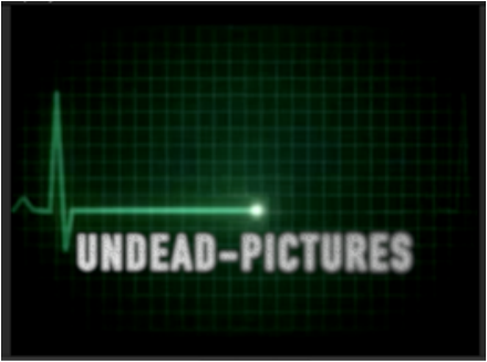
This is currently our finished production company title 'UNDEAD-PICTURES' The obvious link to the zombie genre being 'UNDEAD' allowed us to convey that our production company only distributes zombie horror making it more relevant to our genre. The Title is a muggy, crumpled white which will stand out from the striking green background making it the center of attention. The background taking the colour of a respirator has been reversed so that the flat line symbolizing death is moving backwards suggesting some kind of awakening of life, again linking to zombies and the un-dead. The title will moving into the shot and will quickly fade out to the next shot within our timeline with the Ken Burns effect tagged to it.
|
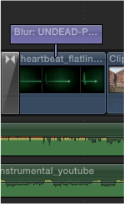
This is our production company in progress which will only last for approximately a second or two . We found from our research that the production company and distributer are only on the screen for a maximum of three seconds in a teaser trailer. We are creating ours using the software final cut pro.
|
